Ivan Petkov
Another challenge we decided to undertake was making our own online store. We said it and we did it. Several months of analysis, development of various modules, tests and here it is - our GRRShop.com store is ready with its first version. There is still room for improvement, and to fill it with more interesting and unique works of Bulgarian designers. In this article I want to present the ideas behind our store.
Unique design and functionality. I will start with the first thing someone notices when opening a website – what it looks like. When we started making the store, which will offer unique and handmade works of Bulgarian artists and designers, we had to decide whether to choose the art design that brings a sense of Bulgaria or to choose a functional design that is universal. We decided on the second option for several reasons:
• Beautiful stores are undeniably eye-catching, but with them a person seems to lose the individual product. We wanted a design that is functional and universal.
• We decided that we would develop and test our store, which we can subsequently offer to anyone who wants a similar store.
• Last but not least, we chose to emphasize the uniqueness of the products we sell and to combine them with an easy to use purchasing system. We chose functionality over beauty, even though we did not completely sacrifice it. We chose nice colours and simple elements.
Drupal and Ubercart. Our store is based on two open source systems, each of which is popular and is continuously developing and improving. We are using Drupal for all of our websites: GRReporter.info, My-iFinder.com, and now for GRRShop.com. By now we are convinced of the stability and flexibility of Drupal, so there were no doubts that we will use it as the basis around which to build our store. For the specific part related to e-shop we had two choices: Ubercart and e-Commerce. Both modules for e-commerce have their strengths and weaknesses. Ultimately we chose Ubercart, because we decided that it corresponds more closely to our needs and requirements.

First page. We chose a bit of an atypical appearance for the first page of our store. Typically, most e-stores have a vertical menu where they have all the major categories of products they offer. And this is accepted as standard. We decided not to comply with this unwritten rule and offer something different. Why? First, the side menu is convenient when it contains a few categories. We intend to offer many products and designers which would have forced us to have an extensive vertical menu with many categories in which we would have had to wonder how to insert a large number of unique products that are difficult to categorize. But even if we thought of universal categorization, the issue with the large number of categories would still remain and people would have to dig in and wonder where a certain product might be.
Secondly, search engines like Google have changed the way to enter a website. In many cases, a potential customer will access different parts of the store through a Google ad, which means that the user will arrive at a specific page from a product search. And according to our observations and statistics from other stores that would be 60 to 80 percent of the entries in our store. Furthermore, users have become accustomed to using search engines. Moreover, before being directed to purchase the majority of users have already done their research and know what they are looking for, so when they enter our store from Google, they have already made their decision. For the above reasons, we decided that it was completely unnecessary to leave such a large menu. However, we have it 'folded' on the site, and we put it on the right at the horizontal bar with our main categories.
The Search Engine on the other hand is an element which is present in almost every internal page.

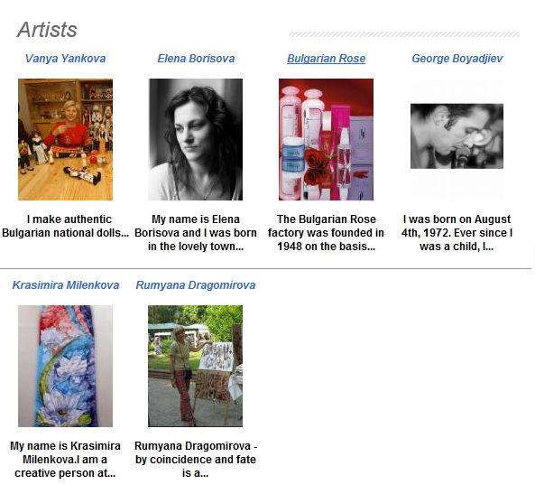
What else did we put on our front page? Something we find useful for our future customers - promotions and discounts, information on new products and recently reviewed items. Presentation of the artists who make the products - we intend to seriously stress on this part of the website, because handmade works carry a piece of the soul and worldview of their creator. We want to make a catalogue of the Bulgarian artists. We want to give them a place to represent themselves with their photos, their most emblematic works, and a little later to have a short video of their studios in order to allow each potential customer to understand to the maximum the atmosphere in which the product they bought or just saw, is created. Our Bulgarian artists do not have such a place on the internet and are very limited in performance and visibility in the global network. Many of them are not in tune with current technologies or do not have the time to deal with the making and promotion of their own websites.